Article Source: Center for Data Innovation
Article Link: https://datainnovation.org/2023/03/visualizing-home-heating-sources/
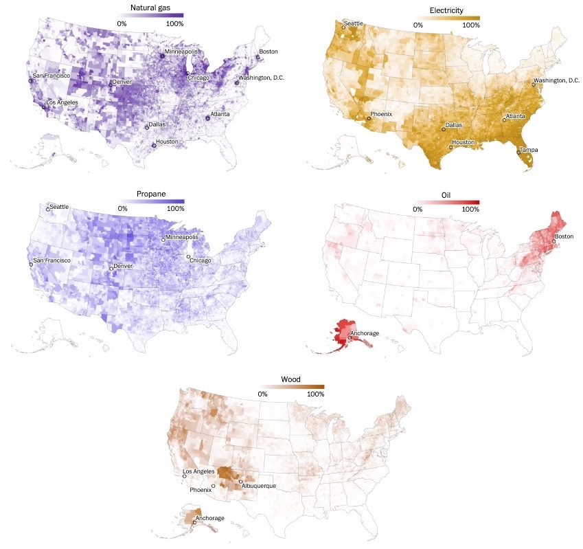
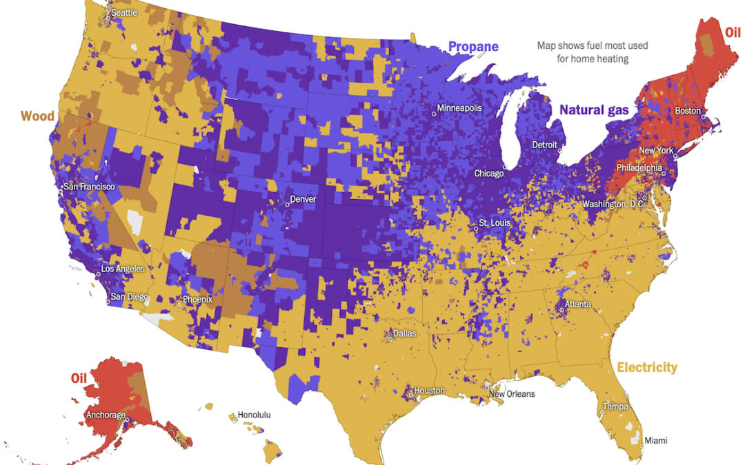
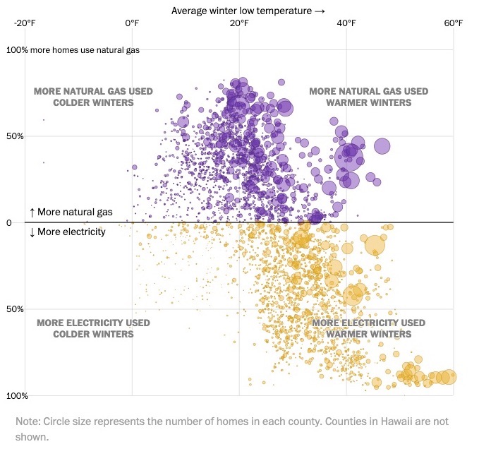
The Washington Post has created a series of visualizations tracking the type of fuel used to heat homes in the United States. One visualization shows the top fuel used in each U.S. county, with electricity appearing as yellow, natural gas appearing as purple, propane appearing as blue, oil appearing as red, and wood appearing as brown. According to the visualizations, counties with warmer winters and rural areas are more likely to use electricity to heat their homes and counties with colder winters and urban areas are more likely to use fossil fuels, such as natural gas, propane, or oil. When combined with data on political leanings, the visualization suggests that the counties most receptive to policies designed to reduce U.S. dependence on fossil fuels are the least prepared to do so.
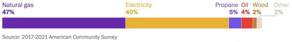
Share of homes heated with…
Share of homes using natural gas and electricity with cold vs. warm winters
Share of homes using…